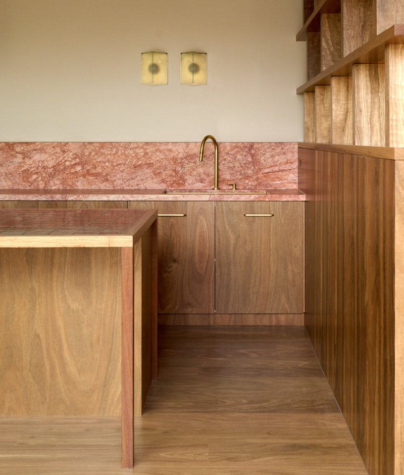
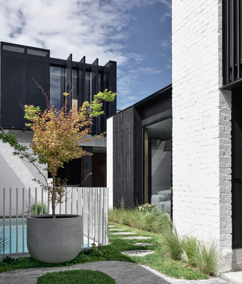
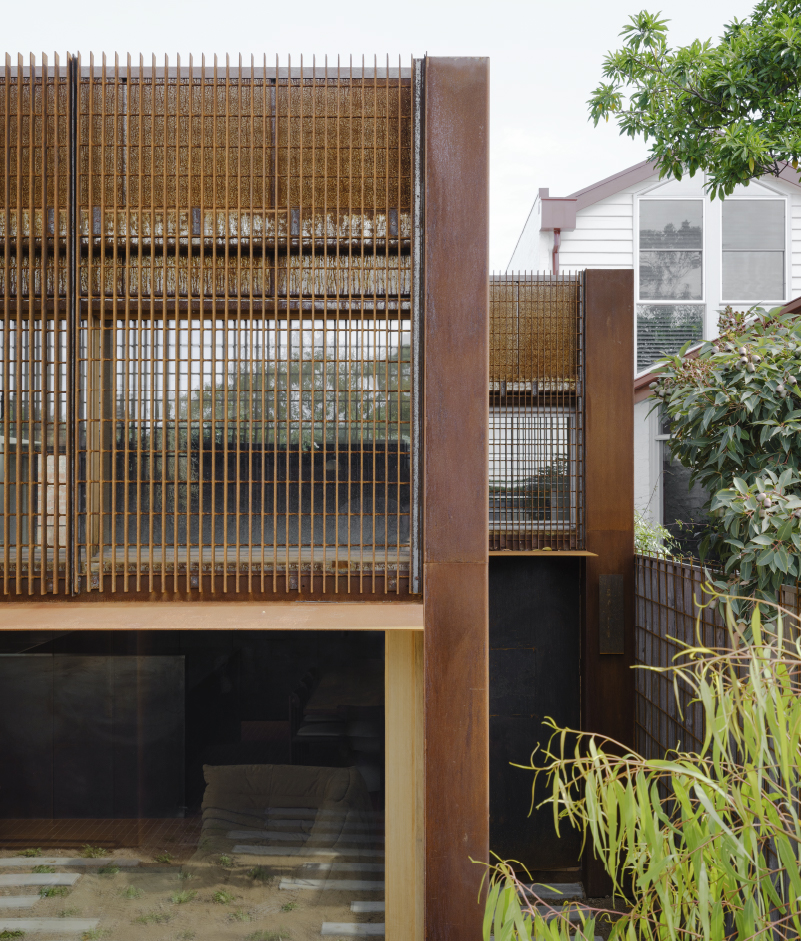
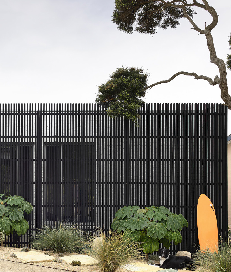
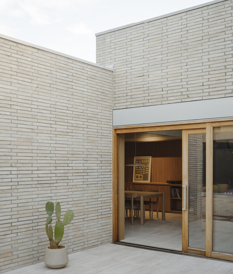
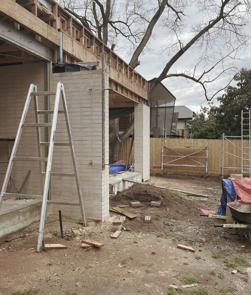
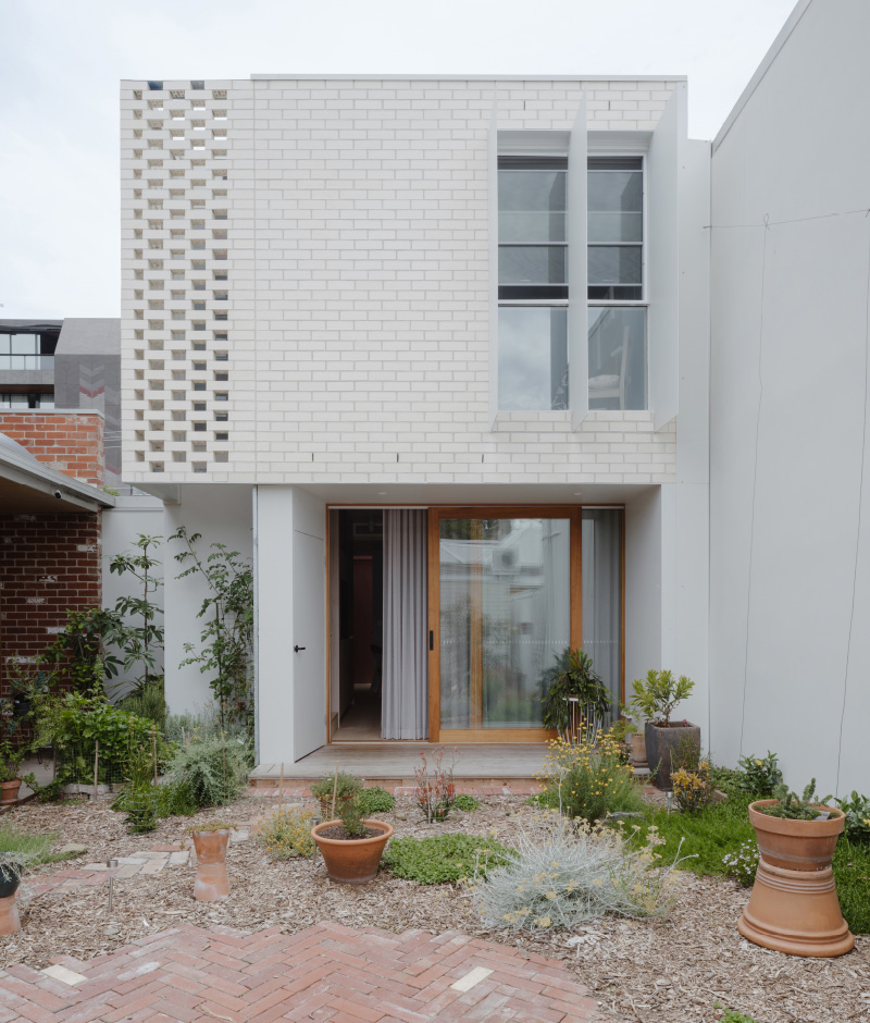
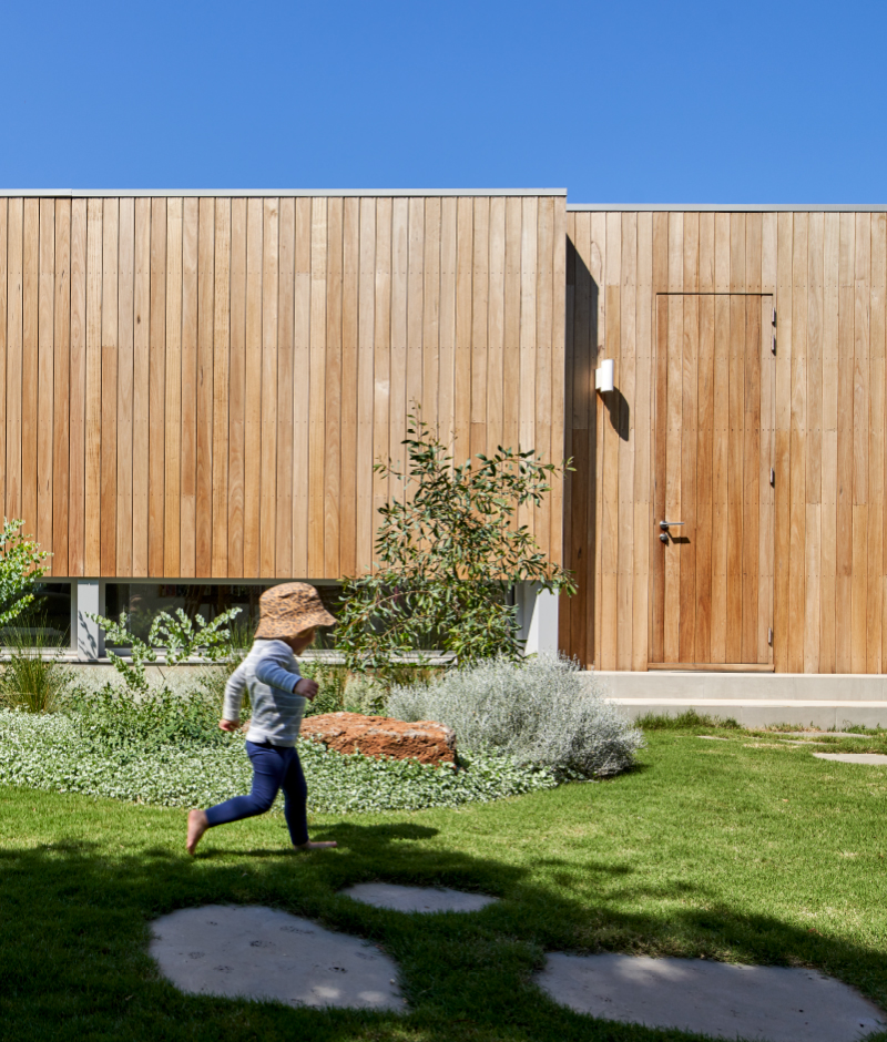
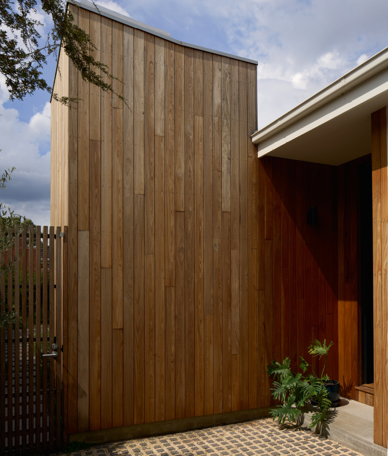
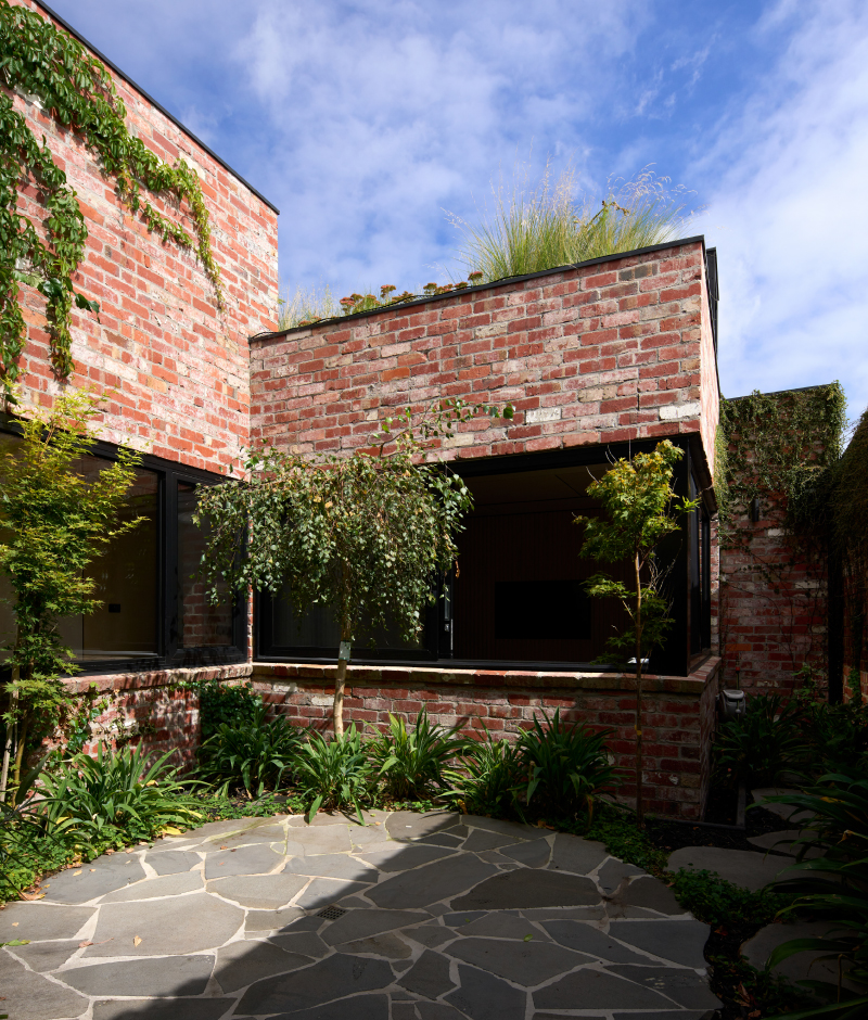
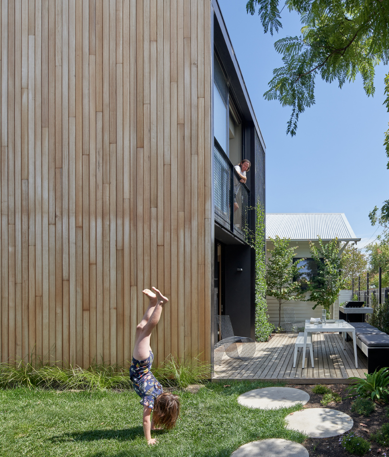
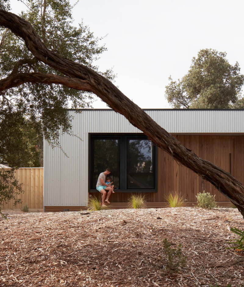
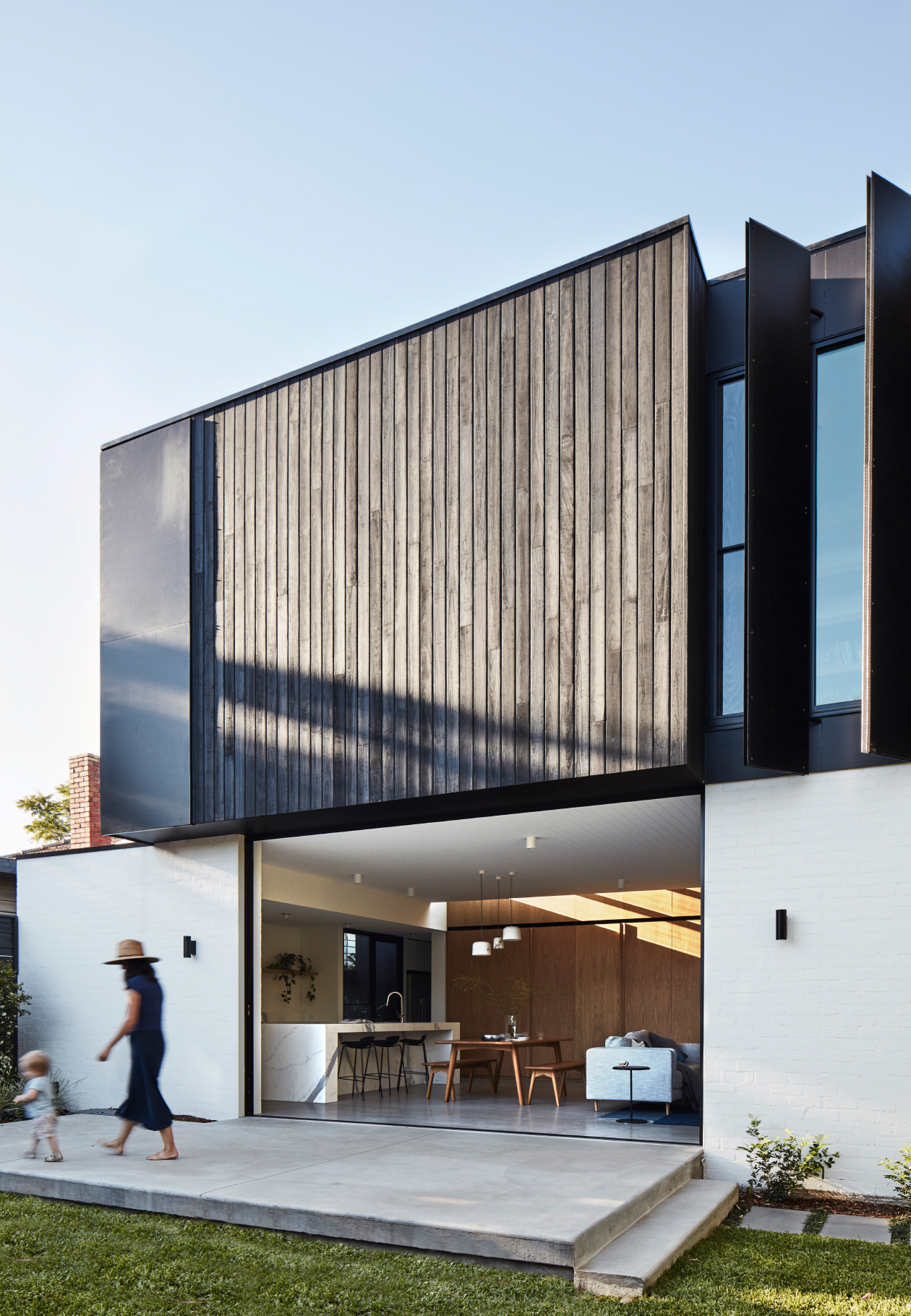
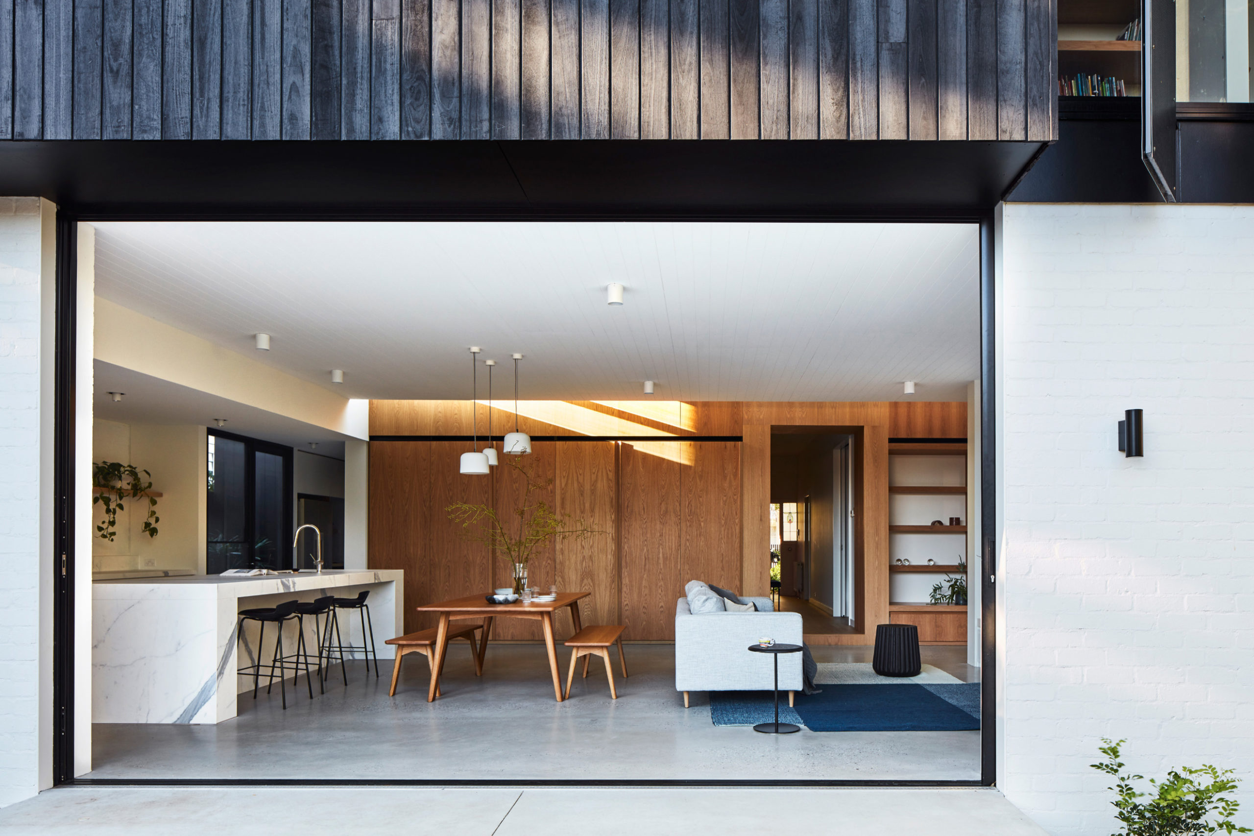
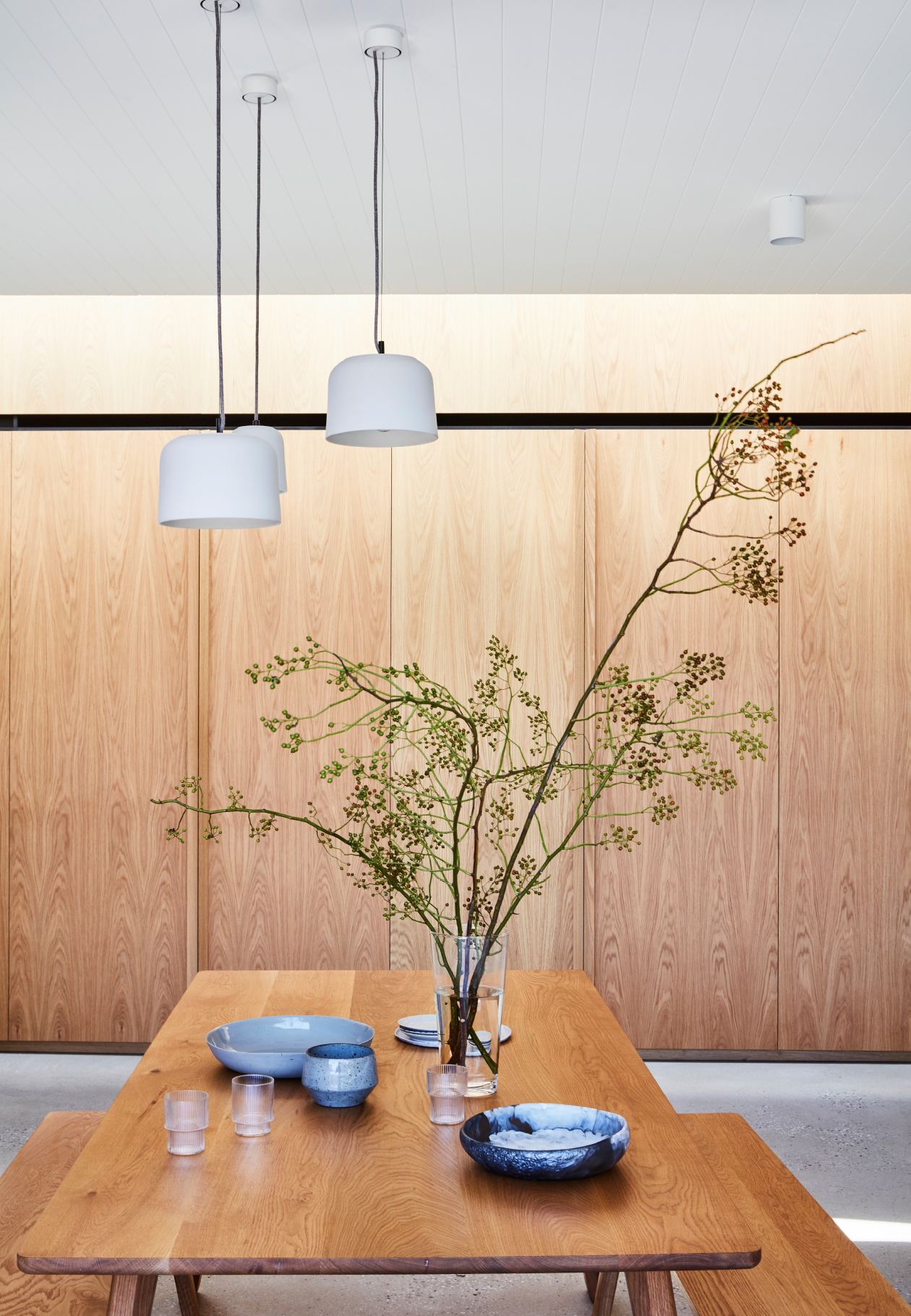
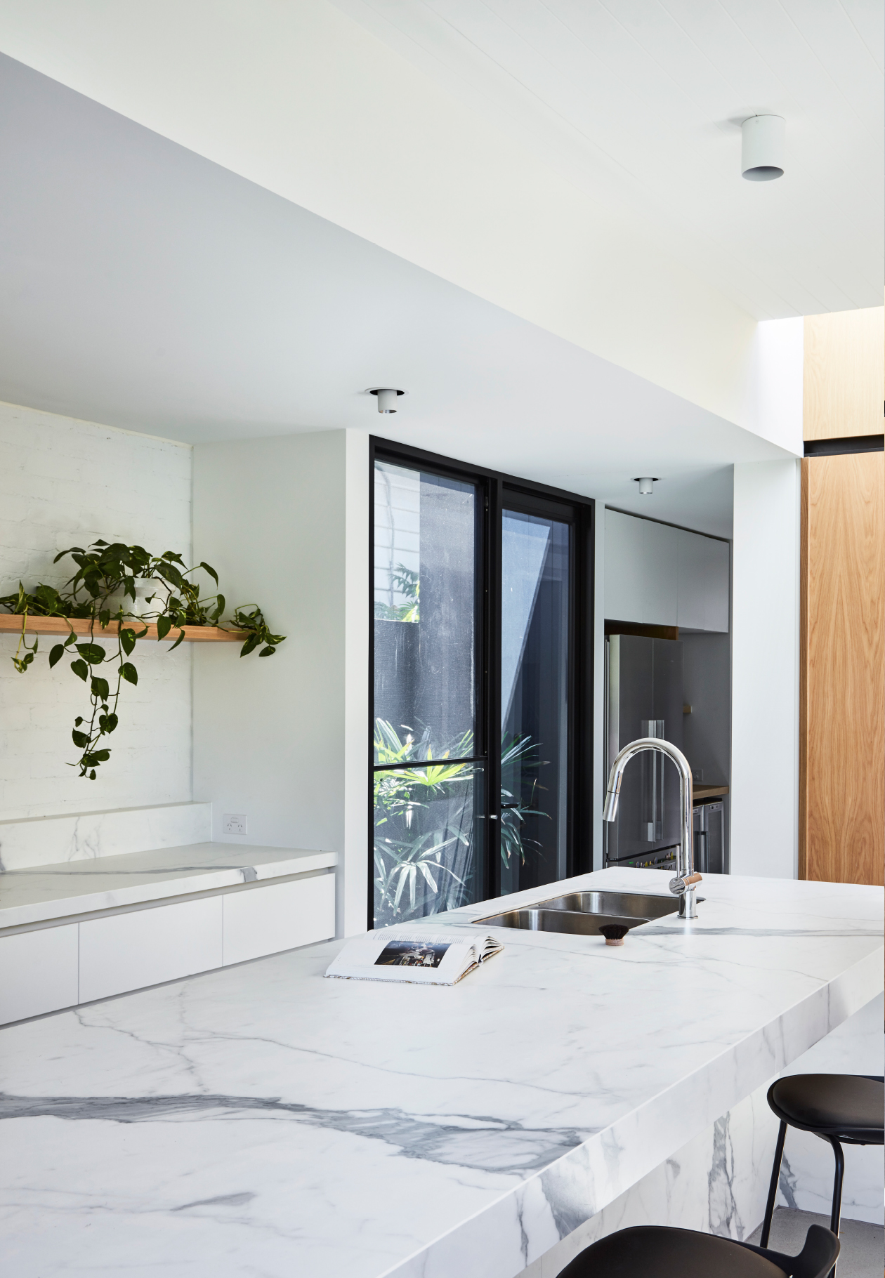
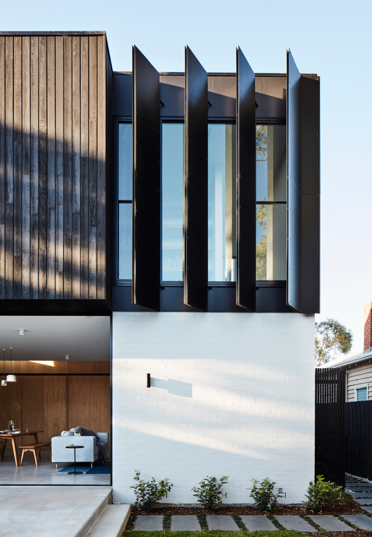
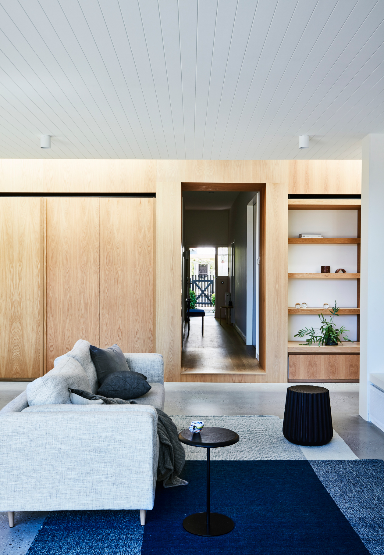
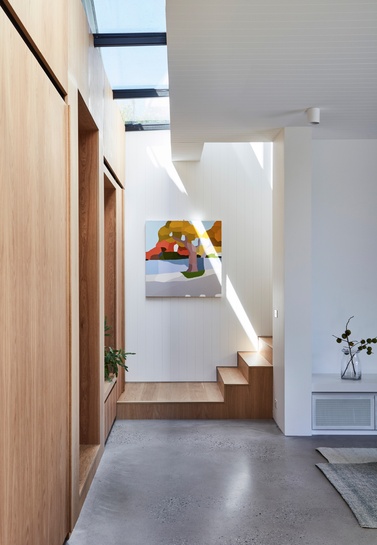
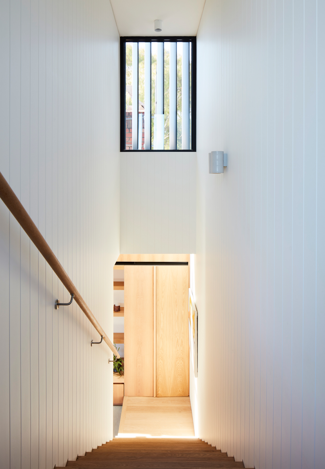
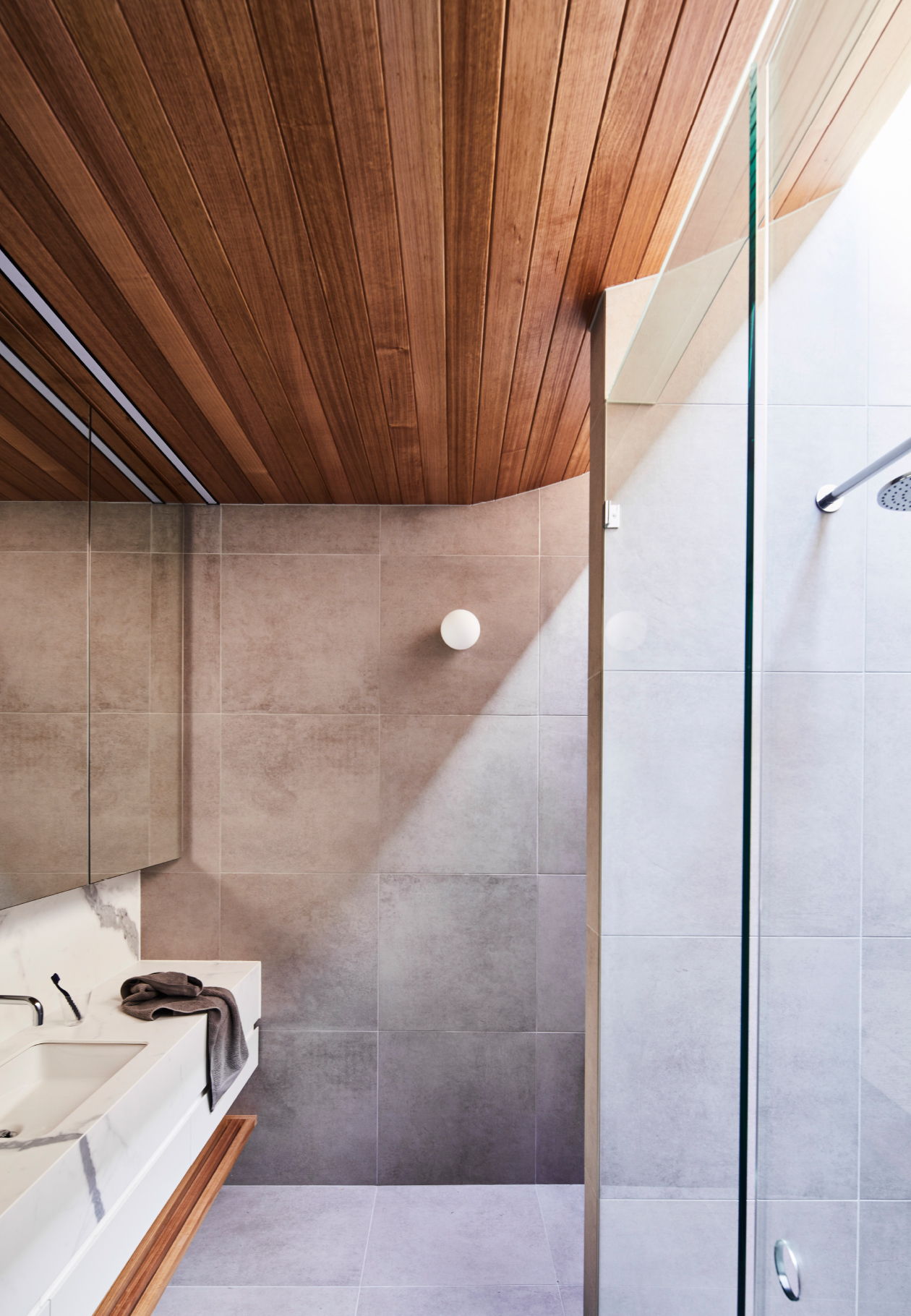
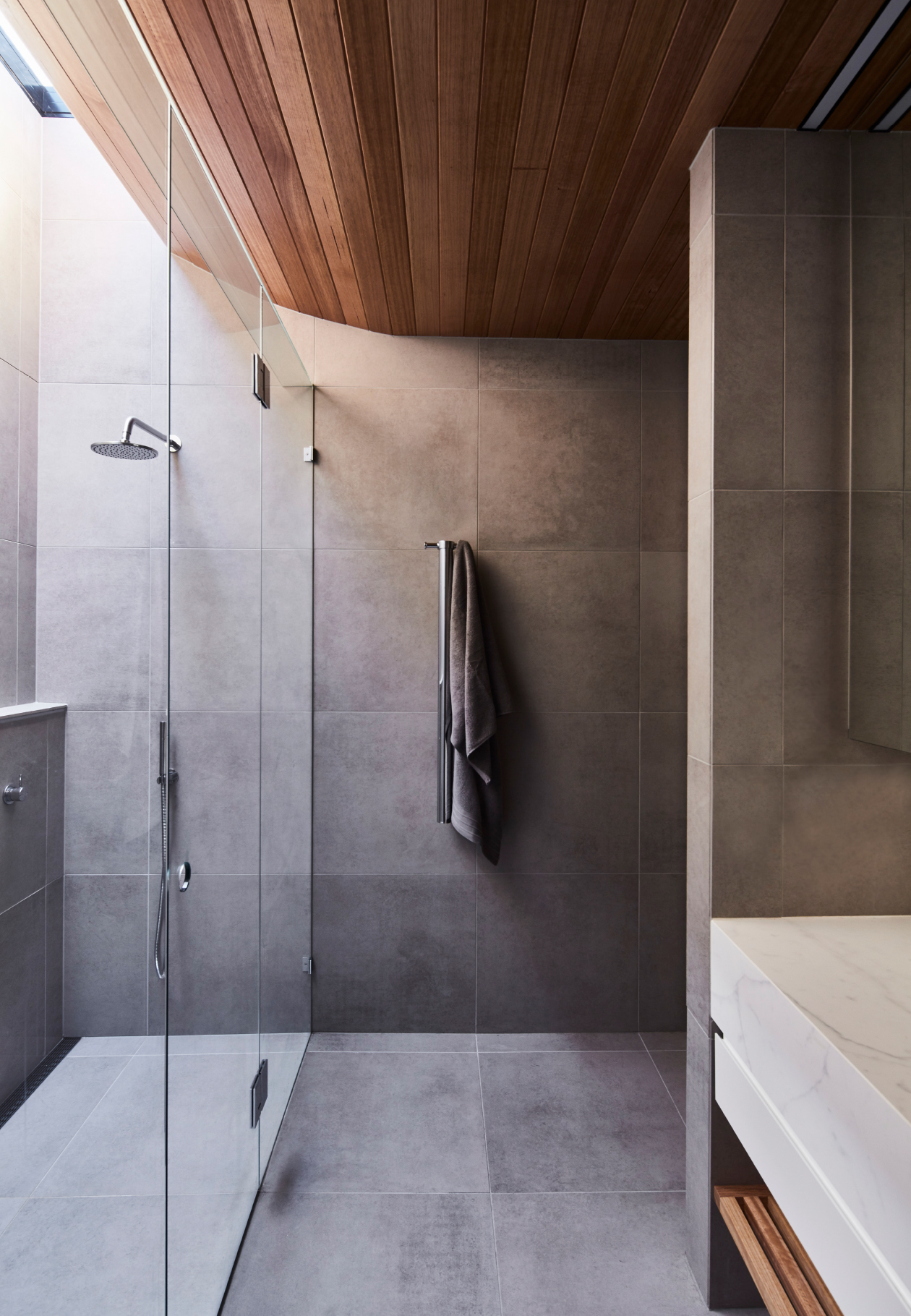
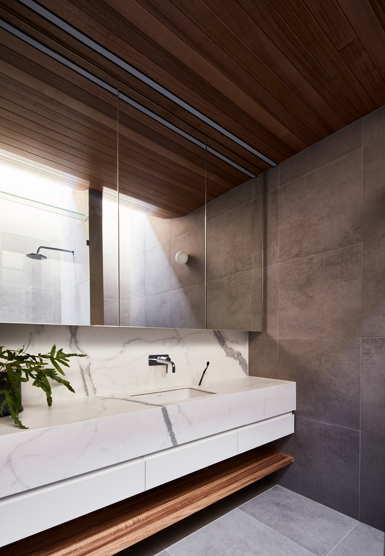
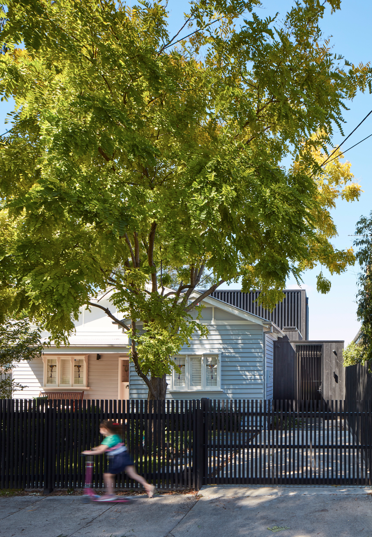
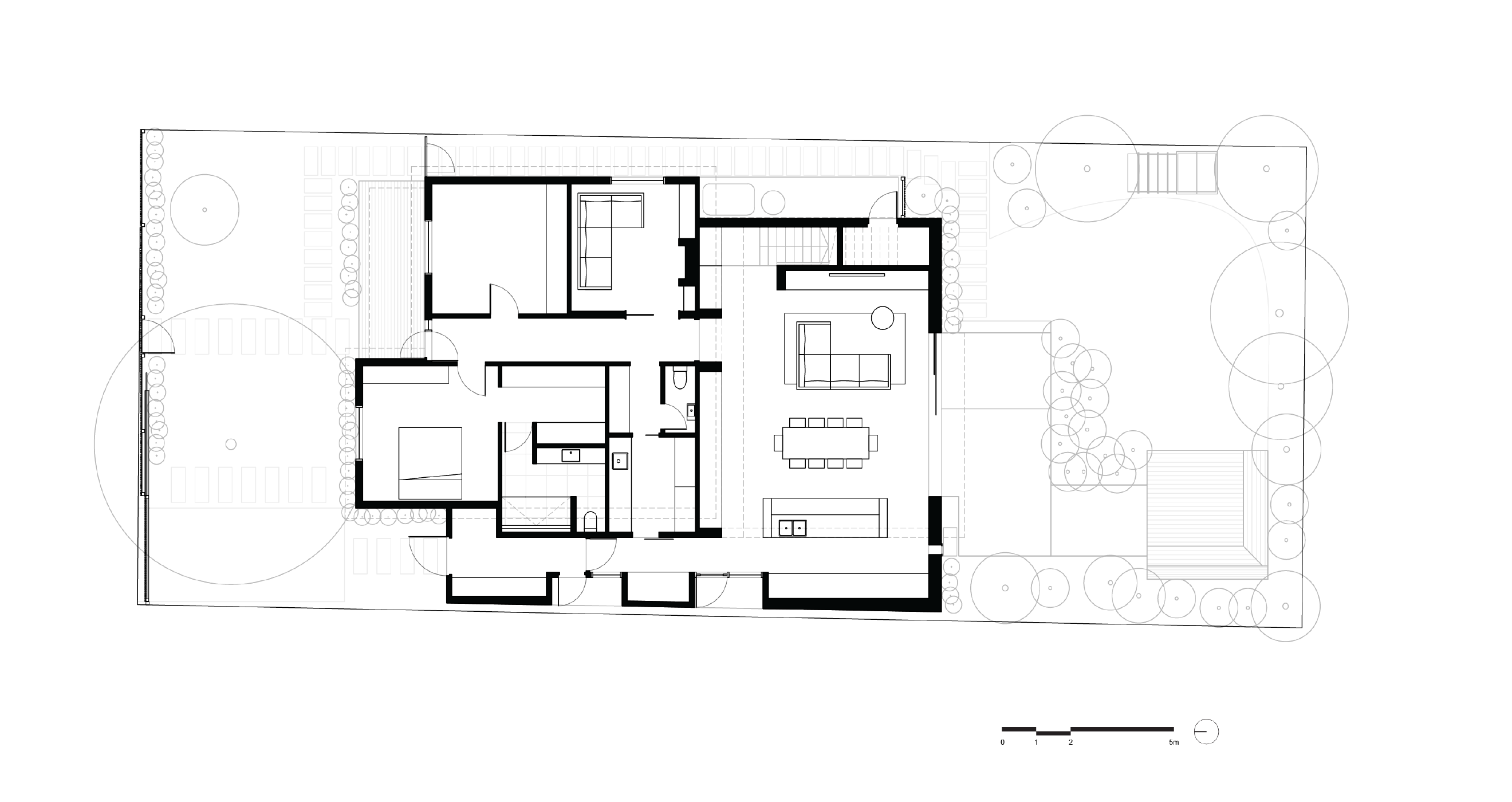
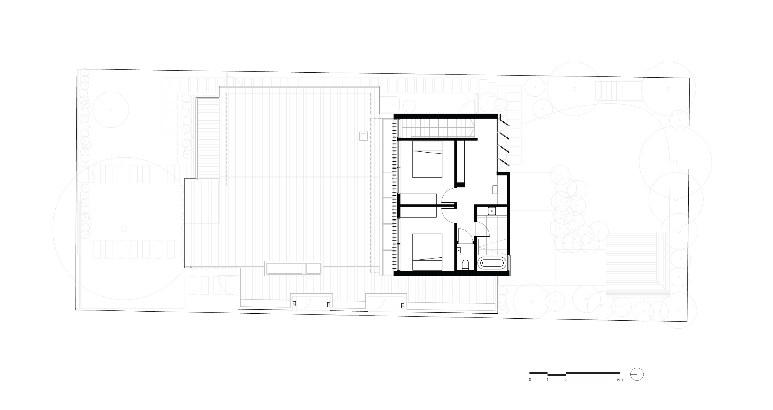
The existing house consisted of a single storey Californian Bungalow set on a relatively large open block. A driving factor of the design was the need for more light to mitigate the southern orientation of the site. In response, Project 12 Architecture designed a new two-storey addition featuring a skylight void to invite in natural light throughout. The new two storey volume to the rear of the existing home accommodates the key living spaces on the ground floor with two bedrooms, bathroom and study area above. This new structure is visually in contrast to the façade’s original design features, materials and colours, and instead incorporates recycled brick, charred timber cladding, and metal perforated screens. Large glazed doors at the rear disappear entirely into the wall cavity to connect the interiors directly to the external terrace and garden.
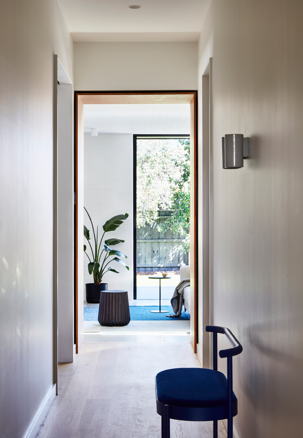
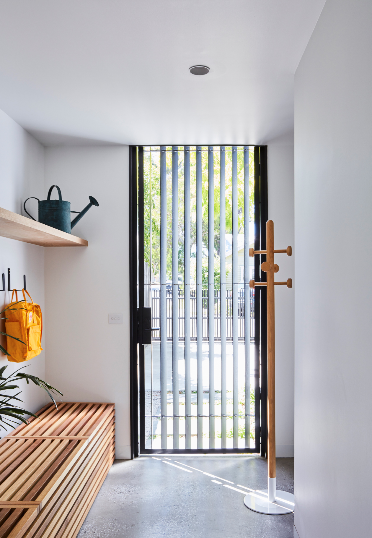
Significant re-planning was also undertaken to the rest of the house to enable a more rational and functional layout. For example, a discrete mudroom entry has been added, providing an immediate, practical home for bags, scooters and general daily mess associated with family living. The existing front door now functions as a more formal entry leading past the master bedroom, study and utility rooms. These ‘adult’ spaces are physically and acoustically separated from living zones and children’s bedrooms.
Ultimately, the design looks to provide a home which responds to the demands of the daily routine of work, kids, and the clutter they bring, and also is an easy and calm space to live in.
| Type | Residential, alterations and additions |
|---|---|
| Location | Northcote, Victoria |
| Country | Wurundjeri |
| Site Area | 637sqm |
| Building Area | 200sqm |
| Completion | 2018 |
Ground Floor
First Floor
The existing house consisted of a single storey Californian Bungalow set on a relatively large open block. A driving factor of the design was the need for more light to mitigate the southern orientation of the site. In response, Project 12 Architecture designed a new two-storey addition featuring a skylight void to invite in natural light throughout. The new two storey volume to the rear of the existing home accommodates the key living spaces on the ground floor with two bedrooms, bathroom and study area above. This new structure is visually in contrast to the façade’s original design features, materials and colours, and instead incorporates recycled brick, charred timber cladding, and metal perforated screens. Large glazed doors at the rear disappear entirely into the wall cavity to connect the interiors directly to the external terrace and garden.
Significant re-planning was also undertaken to the rest of the house to enable a more rational and functional layout. For example, a discrete mudroom entry has been added, providing an immediate, practical home for bags, scooters and general daily mess associated with family living. The existing front door now functions as a more formal entry leading past the master bedroom, study and utility rooms. These ‘adult’ spaces are physically and acoustically separated from living zones and children’s bedrooms.
Ultimately, the design looks to provide a home which responds to the demands of the daily routine of work, kids, and the clutter they bring, and also is an easy and calm space to live in.
| Builder | Topp Constructs |
|---|---|
| Landscape Design | Moore Landscaping |
| Photographer | Glenn Hester |
